Anatomy of a Banger
This ad was made for Blinkist, a well-established SaaS microlearning app that proposes short form audio books. It's been in rotation since June 2024, redeployed again and again and heavily iterated, because it keeps working. Here's what's actually going on inside it.
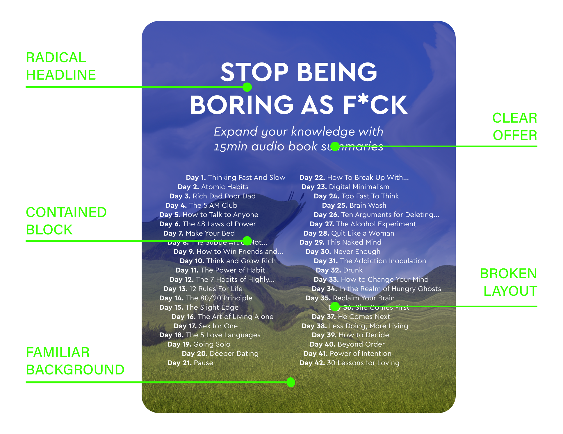
The overall Structure
The instinct is to assume a clean, predictable structure with minimal copy, written big, performs best. This ad does the opposite.
The text blocks are deliberately destructured: a lot of copy, set in a small font, breaking every rule about what's supposed to grab attention. That's exactly what makes a thumb stop. It doesn't read like an ad, it reads like something worth a second look, because it's unusual, yet understandable.
The booklist itself follows the same logic. It shows a large amount of titles, displayed in a small font, all packed. This layout emphasizes the substance of the offer and is easy to take in, contained in one clear block.
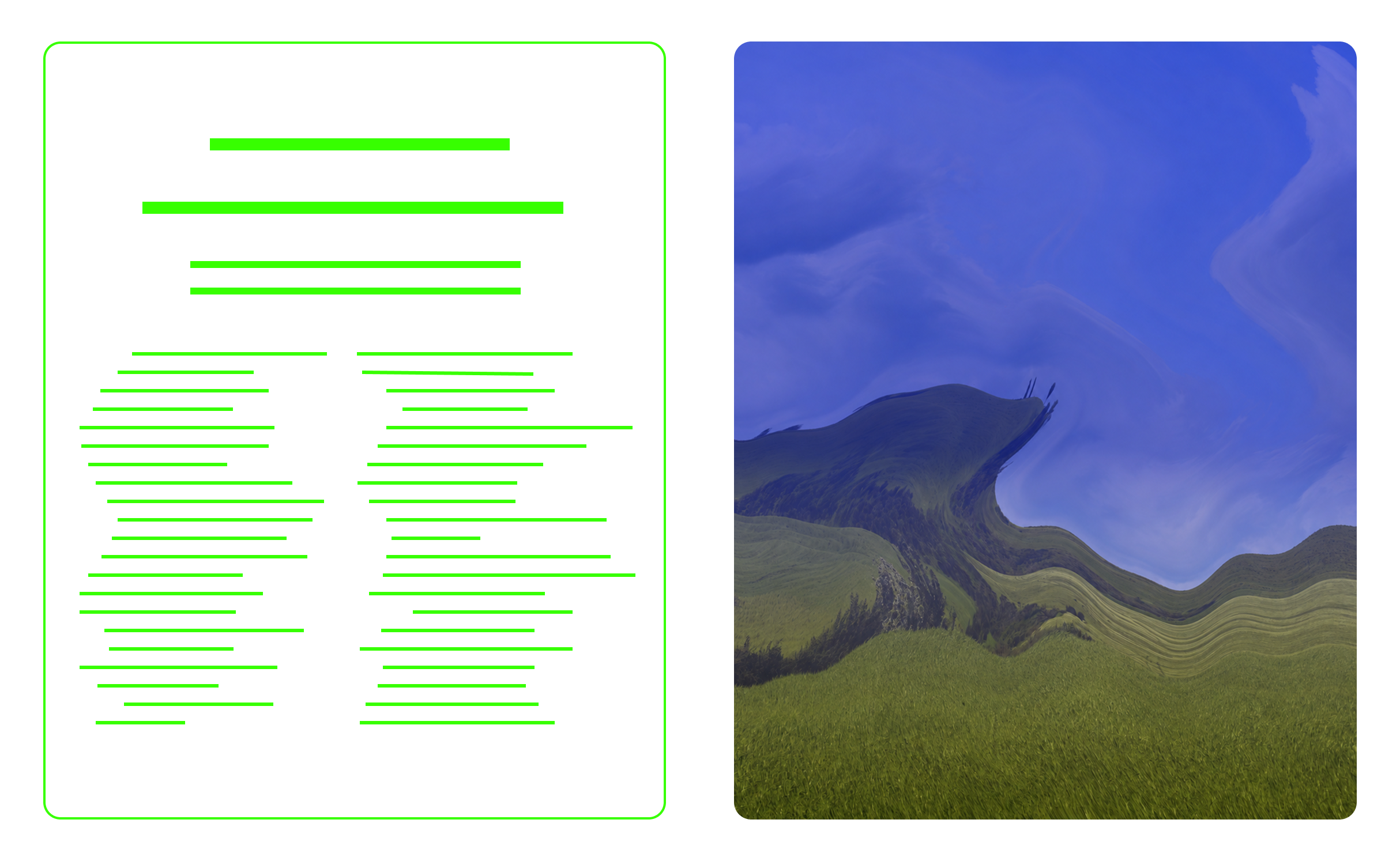
The choice of the background image makes it look weirdly familiar too. The composition and hues of the landscape echo Bliss, the infamous default Windows desktop wallpaper, whilst the distortion makes the eye look at it twice.
The distortion doesn't read as a lack of clarity that makes people scroll past. It acts like a puzzle for the brain, and provokes the exact opposite effect.
The copy
"Stop Being Boring As F*ck" is not a safe headline. It's a deliberate, slightly confrontational choice in a category full of soft, aspirational language. It works because it sounds like a friend calling you out, not a brand pitching you, and that tonal risk is exactly what makes it noticeable.
It's also triggering, as being boring is the last thing you would want to be in an oversaturated world where everyone excels at something.
The baseline proposes a clear value of what you can get and in how long.
STOP BEING BORING AS F*CK ·
STOP BEING BORING AS F*CK ·
The iterations
When an ad performs like this, the goal shifts to iteration and scale, and for good reason:
Find out what's carrying it. Isolate which element is doing the heavy lifting (the headline, the background, the layout) so the success can be reproduced, not just repeated.
Match it to different audiences. One version rarely fits every segment. Iterating lets the same core idea flex across them.
Stay ahead of the algorithm. Run the exact same creative for too long, and Meta starts deprioritizing it.
Avoid ad-fatigue. Once the same audience has seen it too many times, it just slowly dies.
Over 50 versions came out of this one, each one built on the knowledge of the previous one.
The recognition
This ad didn't just perform, it got noticed. Spiral.ad ranked it among the Top 300 live mobile app ads three quarters in a row. Matej Lancaric, a marketing strategist with 12+ years in user acquisition, broke it down in a LinkedIn post of his own. Other brands have benchmarked against it too, which might be the best compliment of all.